 In advance of this weekend’s International Olympic Committee vote regarding squash’s bid for inclusion in the 2020 Olympic Games, US SQUASH announced yesterday a major new component to its elite athlete development programs. Reinforcing its connection to the U.S. Olympic Committee and US Squash’s emphasis on national teams, the Association has also rolled out a new logo and started the process of rebranding. The colors of the new logo are red, white and blue, reflecting the colors of the United States of America’s flag, and similar to other U.S. national sports governing bodies.
In announcing the program termed the Elite Athlete Program, or EAP, CEO Kevin Klipstein previously commented, “We wanted to send a clear message to the community and the sports world that our commitment to our national teams and elite athlete development programs is unconditional and will continue to increase. Our goal is to have US athletes on the podium in international competition, regardless of whether it is the World Championships, Pan American Games, or even the Olympic Games.
“The recent growth of the game and the success of our programs overall allows us to invest more heavily in elite athlete development. Previously an important program among an array of priorities, we are now able to more adequately support all forms of development, ranging from regional junior training squads to our stable of top performing professionals and aspiring professionals, as well as everyone in between.”
New Logo, New Look
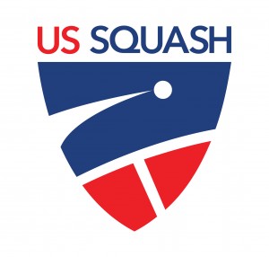
![]() Founded in 1904, US Squash has had a total of six official marks to date (see timeline below), the most classic and enduring being the logo used currently which embodies many of the components of the marks historically such as a shield and racquets. The current mark will now represent the US Squash Hall of Fame, ensuring the legacy of the logo and enhancing the prestige of the Hall of Fame.
Founded in 1904, US Squash has had a total of six official marks to date (see timeline below), the most classic and enduring being the logo used currently which embodies many of the components of the marks historically such as a shield and racquets. The current mark will now represent the US Squash Hall of Fame, ensuring the legacy of the logo and enhancing the prestige of the Hall of Fame.
The new logo uses red, white and blue to more clearly connect the Association to one of its primary goals of continually improving the competitive performance of U.S. squash players through national team programming and its relationship to the U.S. Olympic Committee as the member organization for the sport of squash in the U.S.
The shield shape connects the mark to several of the prior US Squash logos including the most recent mark with a shield outline, yet uses more updated, action oriented symbols including the “streaking ball” and a reference to the “T”, which is the strategic center of the squash court. New font is also utilized in the mark, and US Squash will no longer use periods after the letters U and S.
CEO Kevin Klipstein added, ”We’re pleased with the evolution of our logo, and are looking forward to developing the brand further this season. In merging operations with Squash Magazine which we announced the other week, and a greater emphasis on communications with our varied audiences across all media platforms, we felt it was the right time to rebrand.”
New Logo, New Tagline
US Squash also introduced a new tagline, Fit For Life, since squash is the best workout anyone can get in 45 minutes – and it’s fun. Players are tested to their physical and mental limits if their goal is to be competitive. It is also easy to pick up a racquet and enjoy the sport from the first time on the court, and it can take a lifetime to achieve excellence.
There are more than 1.2 million active squash players in the United States who are ages 6 and older, and that number continues to grow. With a membership which increases each year, and programs for players of all levels reaching tens of thousands of people across the country, squash, and US Squash, are “Fit for Life”.
If you are looking to enhance your experience with squash and get involved with the biggest and most passionate squash community in the United States, linking yourself with US Squash is a must.
For those authorized to use US Squash’s marks, please refer here to the updated Brand Guidelines.
![]()